[練習課程] JavaScript 實作(二):數位時鐘設計


本篇介紹兩種寫法,一種是透過圖片來代表圖片文字,另一個是直接改值(需考量補 0)。

大致設計步驟如下:

  1. 使用者一進網頁就先執行一個角色命名的事件 A
  2. A 結束後,提問是否選擇遊戲開始事件 B,所以畫面上有個 B 事件的按鈕
  3. 事件 B 是連續的多個判斷 T/F 路線走向,一但失敗仍可由畫面上的 B 事件按鈕觸發
  4. 如果順利走完事件 B,觸發一個事件 C,主要是把畫面上的 B 事件觸發給取消

圖片表示法

你可以透過 www.freepick.com 取得免費圖片資源加以設計,使含有 0~9 跟:的圖案,做成連續且同張圖片即可。如下

digital number

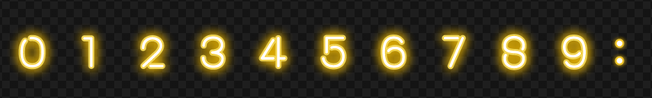
每個數字的長寬是 100*100,冒號為 50*100。我們利用 background 代替數字號碼去顯示圖片,但只顯示出 100*100,透過 background-position 去控制要顯示幾號也就是往左或往右推多少 100px。

HTML+CSS

先規劃出你的 HTML+CSS。使得畫面有出現最基本的節點能任意控制這些時間欄位。

HTML 主要顯示三大區域 (.ck) 分別是時 (#ck1,#ck2) 分 (#ck3,#ck4) 秒 (#ck5,#ck6),每個區域有十位數跟個位數。三大區域之間有冒號做顯示 (.cc)。

<div id="clock1">
<span class="ck">
<span id="ck1" class="c1"></span>
<span id="ck2" class="c2"></span>
</span>
<span class="cc"></span>
<span class="ck">
<span id="ck3" class="c3"></span>
<span id="ck4" class="c4"></span>
</span>
<span class="cc"></span>
<span class="ck">
<span id="ck5" class="c5"></span>
<span id="ck6" class="c6"></span>
</span>
</div>

css 調整好版型,然而 c0~c9 主要是提供每個數字代表多少定位,使其差異內容化。

<style>
body {
background: #222;
margin: 0;
}
#clock1 {
width: 740px;
height: 100px;
background: rgba(88, 45, 98, 0.5);
margin: 20vh auto;
padding: 10px;
display: flex;
}
.ck {
display: inline-flex;
}
.c1,.c2,.c3,.c4,.c5,.c6,.c7,.c8,.c9,.c0 {
width: 100px;
height: 100px;
background: url("number.jpg");
display: inline-block;
}
.cc {
width: 50px;
height: 100px;
background: url("number.jpg");
background-position: 50px;
display: inline-block;
margin: 0 10px;
}
.c1 { background-position: 0px; }
.c2 { background-position: -100px; }
.c3 { background-position: -200px; }
.c4 { background-position: -300px; }
.c5 { background-position: -400px; }
.c6 { background-position: -500px; }
.c7 { background-position: -600px; }
.c8 { background-position: -700px; }
.c9 { background-position: -800px; }
.c0 { background-position: -900px; }
</style>

在還沒有 JS 發動之前,畫面效果如下:(出現 123456 是因為 html 這裡是用 c1~c6 做初始預設的 class)
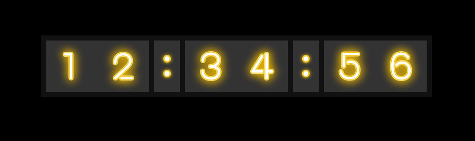
接著規劃 JS,分為幾個動作思考

  1. 透過 new Date() 去得出目前時間,並將時間整理成六個數字分別代表時分秒的十位數&個位數。然後透過 DOM 去改寫 className 的數值,使得 class 之 c0~c9 可以順利代表數字
  2. 再來是透過 setTimeout 幫助你每 1 秒再執行一次步驟 1,形成無限跑數字的連續效果。
  3. 然後再來思考冒號每 500 毫秒做開關動作(透明度 0 或 1),你可以規劃每 500 豪秒做 off,每 1000 毫秒做 on

JS 部分

function retime() {//執行 DOM 的變化
setTimeout(retime, 1000); //1 秒之後,去跑 retime 這個動作

let nt = new Date();
let n_hour = nt.getHours();
let n_min = nt.getMinutes();
let n_sec = nt.getSeconds();

//時分秒的個位數
let n_hx = n_hour % 10;
let n_mx = n_min % 10;
let n_sx = n_sec % 10;

//時分秒的十位數
let n_ht = Math.floor(n_hour / 10);
let n_mt = Math.floor(n_min / 10);
let n_st = Math.floor(n_sec / 10);

document.getElementById("ck1").className = "c" + n_ht;
document.getElementById("ck2").className = "c" + n_hx;
document.getElementById("ck3").className = "c" + n_mt;
document.getElementById("ck4").className = "c" + n_mx;
document.getElementById("ck5").className = "c" + n_st;
document.getElementById("ck6").className = "c" + n_sx;

document.getElementsByClassName("cc")[0].style.opacity = 1;
document.getElementsByClassName("cc")[1].style.opacity = 1;

//有兩行 dom 晚 500 毫秒執行
setTimeout(function(){
document.getElementsByClassName("cc")[0].style.opacity = 0;
document.getElementsByClassName("cc")[1].style.opacity = 0;
},500);
}

retime();

文字表示法

這裡比較簡單的使用文字就能代表時間,我們把功能擴展到除了時分秒,還有年月日與日期。以及多一個 CSS animation 效果去裝飾 RGB。

HTML+CSS

<div id="clock2">
<p id="clk2-time">12:00:00</p>
<p id="clk2-date">2019-12-06 MON</p>
</div>
#clock2 {
width: 600px;
height: 300px;
/* background: #555; */
margin: 50px auto;
text-align: center;
display: flex;
justify-content: space-around;
flex-flow: column nowrap;
font-family: "Orbitron", sans-serif;
animation: light 10s linear infinite;
}
#clk2-time {
font-size: 6rem;
margin: 0;
}
#clk2-date {
font-size: 3rem;
margin: 0;
}

同時設計一個呼吸燈的效果用 animation 去執行 keyframe。這裡要思考的是,變化從 0 到 100%的時間軸過程中,顏色這裡我們使用 hsla(顏色範圍 0~360, 飽和度 100%, 明度 0~30%, 透明度 1)。方便你控制一個循環的分配顏色,明度稍微差距一些,但主要背景是深色,這裡明度採低值適合。

顏色我們規劃這裡的 box-shadow 同時寫兩筆濾鏡:分別為盒內陰影 (box-shadow+inset)+盒外陰影 (box-shadow),另還有文字陰影 (text-shadow),高明度的文字顏色 (color)。

@keyframes light {
from {
/*fat*/
box-shadow: inset 0 0 300px hsla(0, 100%, 15%, 1), 0 0 200px hsla(0, 100%, 0%, 1);
text-shadow: 0 0 200px hsla(0, 100%, 60%, 1), 0 0 40px hsla(0, 100%, 30%, 1);
color: hsla(0, 100%, 95%, 1);
}

10% {
/*thin*/
box-shadow: inset 0 0 20px hsla(36, 100%, 15%, 1), 0 0 40px hsla(36, 100%, 0%, 1);
text-shadow: 0 0 10px hsla(36, 100%, 60%, 1), 0 0 40px hsla(36, 100%, 30%, 1);
color: hsla(36, 100%, 95%, 1);
}

20% {
/*fat*/
box-shadow: inset 0 0 300px hsla(72, 100%, 15%, 1), 0 0 200px hsla(72, 100%, 0%, 1);
text-shadow: 0 0 200px hsla(72, 100%, 60%, 1), 0 0 40px hsla(72, 100%, 30%, 1);
color: hsla(72, 100%, 95%, 1);
}

30% {
/*thin*/
box-shadow: inset 0 0 20px hsla(108, 100%, 15%, 1), 0 0 40px hsla(108, 100%, 0%, 1);
text-shadow: 0 0 10px hsla(108, 100%, 60%, 1), 0 0 40px hsla(108, 100%, 30%, 1);
color: hsla(108, 100%, 95%, 1);
}

40% {
/*fat*/
box-shadow: inset 0 0 300px hsla(144, 100%, 15%, 1), 0 0 200px hsla(144, 100%, 0%, 1);
text-shadow: 0 0 200px hsla(144, 100%, 60%, 1), 0 0 40px hsla(144, 100%, 30%, 1);
color: hsla(144, 100%, 95%, 1);
}

50% {
/*thin*/
box-shadow: inset 0 0 20px hsla(180, 100%, 15%, 1), 0 0 40px hsla(180, 100%, 0%, 1);
text-shadow: 0 0 10px hsla(180, 100%, 60%, 1), 0 0 40px hsla(180, 100%, 30%, 1);
color: hsla(180, 100%, 95%, 1);
}

60% {
/*fat*/
box-shadow: inset 0 0 300px hsla(216, 100%, 15%, 1), 0 0 200px hsla(216, 100%, 0%, 1);
text-shadow: 0 0 200px hsla(216, 100%, 60%, 1), 0 0 40px hsla(216, 100%, 30%, 1);
color: hsla(216, 100%, 95%, 1);
}

70% {
/*thin*/
box-shadow: inset 0 0 20px hsla(252, 100%, 15%, 1), 0 0 40px hsla(252, 100%, 0%, 1);
text-shadow: 0 0 10px hsla(252, 100%, 60%, 1), 0 0 40px hsla(252, 100%, 30%, 1);
color: hsla(252, 100%, 95%, 1);
}

80% {
/*fat*/
box-shadow: inset 0 0 300px hsla(288, 100%, 15%, 1), 0 0 200px hsla(288, 100%, 0%, 1);
text-shadow: 0 0 200px hsla(288, 100%, 60%, 1), 0 0 40px hsla(288, 100%, 30%, 1);
color: hsla(288, 100%, 95%, 1);
}

90% {
/*thin*/
box-shadow: inset 0 0 20px hsla(324, 100%, 15%, 1), 0 0 40px hsla(324, 100%, 0%, 1);
text-shadow: 0 0 10px hsla(324, 100%, 60%, 1), 0 0 40px hsla(324, 100%, 30%, 1);
color: hsla(324, 100%, 95%, 1);
}

to {
/*fat*/
box-shadow: inset 0 0 300px hsla(360, 100%, 15%, 1), 0 0 200px hsla(360, 100%, 0%, 1);
text-shadow: 0 0 200px hsla(360, 100%, 60%, 1), 0 0 40px hsla(360, 100%, 30%, 1);
color: hsla(360, 100%, 95%, 1);
}

}

還有文字 font,這裡利用 google font 字型 (Share Tech Mono)

<link href="https://fonts.googleapis.com/css?family=Share+Tech+Mono&display=swap" rel="stylesheet">

js 部分

我們除了時分秒,還要計算年月日週。要注意多一個判別,如果數字比 10 小要多補一個 0 在前面。
var n_day = ['SUN', 'MON', 'TUS', 'WED', 'THR', 'FRI', 'SAT'];
function re_time() {
setTimeout("re_time()", 1000);
nt = new Date();
n_hour = nt.getHours(); //時
n_min = nt.getMinutes();//分
n_sec = nt.getSeconds();//秒 65

n_year = nt.getFullYear();//年
n_moth = nt.getMonth();
n_date = nt.getDate();
d_item = nt.getDay();

function chk0(num) {
return (num < 10) ? "0" + num : num;
}

document.getElementById("clk2-time").textContent = `${chk0(n_hour)}:${chk0(n_min)}:${chk0(n_sec)}`;
document.getElementById("clk2-date").textContent = `${n_year}-${n_moth + 1}-${n_date} ${n_day[d_item]}`;

}
re_time();

示範參考: