[獨自升級] TailwindCSS v4.1 - 安裝與介紹

TailwindCSS 是一個功能類優先的 CSS 框架,它提供了大量預定義的實用工具類,讓您能夠快速構建現代化的使用者介面。本課程將深入介紹 TailwindCSS 的核心概念、安裝方法,並提供完整的公式表供快速參考。
介紹 TailwindCSS
TailwindCSS 是由 Adam Wathan 開發的現代化 CSS 框架,採用「功能類優先」(Utility-First)的設計理念。與傳統的 CSS 框架不同,TailwindCSS 不提供預製的元件,而是提供數百個實用工具類,讓開發者直接在 HTML 中組合使用。
設計哲學
TailwindCSS 的設計哲學是「約束創造自由」。通過提供一套一致的設計系統,開發者可以專注於功能實現,而不必擔心樣式設計的一致性問題。
TailwindCSS 的三大特色:
- 功能類優先:直接在 HTML 中使用預定義的 CSS 類別
- 響應式設計:內建響應式斷點系統
- 高度可定制:可根據專案需求調整配置
與 Bootstrap 比較
雖然 TailwindCSS 和 Bootstrap 都是 CSS 框架,但它們的設計理念和使用方式有顯著差異。
| 特性 | TailwindCSS | Bootstrap |
|---|---|---|
| 設計哲學 | 功能類優先 | 元件優先 |
| 學習曲線 | 較陡峭 | 較平緩 |
| 檔案大小 | 可優化至很小 | 相對較大 |
| 定制性 | 高度可定制 | 有限定制 |
| 設計一致性 | 需要自行維護 | 內建一致性 |
使用場景
選擇建議:
- 選擇 TailwindCSS:需要高度定制化、追求最小化 CSS 檔案、團隊有設計系統
- 選擇 Bootstrap:快速原型開發、需要現成元件、團隊缺乏設計資源
程式碼對比範例
Bootstrap 方式:
<div class="card"> |
TailwindCSS 方式:
<div class="bg-white rounded-lg shadow-md p-6"> |
Tree-shaking 機制
Tree-shaking 是一種優化技術,用於移除專案中未使用的程式碼。在使用 TailwindCSS 時,透過 PostCSS 插件和 Node.js 建置流程,可以自動移除未使用的 CSS 類別,達到檔案優化的目的:
- 掃描專案檔案並識別實際使用的 CSS 類別
- 移除未使用的樣式並產生最小化的 CSS 檔案
- 開發時可使用全部功能類別,建置時自動優化
- 最終的 CSS 檔案大小可以從數 MB 縮減到幾 KB,大幅提升網站載入速度與效能。
graph LR
A["完整的 TailwindCSS<br/>(數 MB)"]
B["掃描專案檔案"]
C["識別使用的類別"]
D["移除未使用樣式"]
E["最終 CSS<br/>(幾 KB)"]

A --> B
B --> C
C --> D
D --> E
安裝方式
TailwindCSS 提供兩種主要安裝方式:CDN 與 Node 安裝。CDN 不需要任何設定就能使用,但會載入完整樣式表;Node 安裝需要搭配 tailwind.config.js 綁定掃描路徑,建置時可自動移除未使用的樣式(Tree-shaking / Purge)。
使用 CDN(快速開始)
最簡單的方式,適合學習與快速原型:
|
此外,在不建立專案建置流程的前提下,仍可透過行內設定客製化主題,但注意的是,這樣的設定方式不支援所有外掛生態,僅適合簡單客製。
|
注意:CDN 特色
- 不需配置
tailwind.config.js - 載入完整樣式表,檔案較大,不建議用於生產環境
- CDN 模式不會 Tree-shake,且外掛支援有限;複雜專案請改用 Node 安裝。
使用 Node 安裝(建議)
適合正式專案,可客製化與移除未用樣式,產出最小化 CSS。由於 Tailwind CSS 本身就是一個 PostCSS 的外掛,因此需要 PostCSS 這個 JavaScript 工具來處理與轉換 CSS。PostCSS 不僅能讓 Tailwind 的功能類別轉換成真正的 CSS,透過 autoprefixer 外掛還可以自動添加瀏覽器前綴(例如 -webkit-)。
大多數使用 Tailwind CSS 的環境都是 Node 環境,因此在 Node 環境下安裝 Tailwind CSS 最簡單的方式是使用 npm。
優點:
- 可設定
content掃描路徑,自動移除未使用的類別 - 可客製主題、安裝外掛、支援深色模式策略
- 整合現代建置工具(Vite、Webpack、Rollup 等)
方式一:Vite + Tailwind
Vite + Tailwind 適合現代前端專案,特別是使用 React、Vue、Svelte 等框架的複雜應用。這種方式提供優秀的開發體驗,包括快速的熱重載、現代 JavaScript 語法支援、內建最佳化和程式碼分割功能。對於需要多人協作、效能優化或未來擴展的生產專案來說,Vite + Tailwind 是最佳選擇。
Vite 是現今最受歡迎的前端建置工具之一,相較於傳統的 Webpack,它具有以下優勢:
- 開發環境使用原生 ES 模組,不需打包,啟動速度比 Webpack 快 10-100 倍
- 簡單的配置方式,不需要複雜的 webpack.config.js
- 內建開發伺服器,支援 HMR (Hot Module Replacement)
- 預設支援 TypeScript、JSX、CSS 等多種檔案格式
Tailwind CSS v4.1 針對 Vite 用戶提供了全新的 @tailwindcss/vite 插件,大幅簡化了安裝和配置流程。新版本不再需要手動配置 PostCSS,讓設定更加簡潔。
TailwindCSS v4.1 的新特性:
- 全新的
@tailwindcss/vite官方插件 - 自動處理 PostCSS 配置
- 更快的建置速度
- 簡化的設定流程
- 更好的開發體驗
以下是在 Vite 專案中安裝 Tailwind CSS v4.1 的步驟:
# 建立 Vite 專案(如果還沒有的話) |
設定 vite.config.js 來啟用 Tailwind CSS v4.1 插件:
import { defineConfig } from 'vite' |
v4.1 的改進:
- 不再需要手動建立
tailwind.config.js和postcss.config.js - 插件會自動處理所有必要的配置
- 更簡潔的設定流程
- 更好的開發體驗
在 CSS 檔案中引入 Tailwind CSS:
/* 引入 Tailwind CSS v4.1 */ |
v4.1 的新語法:
- 使用
@import "tailwindcss"替代舊版的@tailwind指令 - 更簡潔的引入方式
- 自動包含所有 Tailwind CSS 功能
在入口檔匯入樣式(例如 main.js):
// import:ES6 模組語法,用來引入其他檔案 |
啟動開發伺服器:
# npm run dev:執行 package.json 中定義的 dev 指令 |
v4.1 的優勢:
- 自動熱重載:修改 CSS 或 HTML 時,變更會立即反映在瀏覽器中
- 更快的編譯速度:優化的編譯流程,減少等待時間
- 更好的錯誤提示:更清晰的錯誤訊息和警告
- 簡化的配置:不需要額外的設定檔案
核對 package.json 指令(若使用官方範本通常已內建):
{ |
package.json scripts 說明:
"dev": "vite":開發模式,啟動開發伺服器"build": "vite build":建置生產版本,自動優化 Tailwind CSS"preview": "vite preview":預覽建置後的檔案
注意:
- v4.1 版本會自動處理所有 Tailwind CSS 相關的配置
- 不需要手動配置 PostCSS 或其他工具
- 執行
vite build打包時會自動移除未使用的樣式(Tree-shaking),優化最終的 CSS 檔案大小 - 使用
@import "tailwindcss"替代舊版的@tailwind指令
npm 與 npx(v4.1 版本)
npm(Node Package Manager)主要用途是管理套件(安裝 / 移除 / 更新 / 執行 scripts)。
常見用途為:
npm install <package>→ 安裝套件npm uninstall <package>→ 移除套件npm run <script>→ 執行 package.json 裡的自定義指令(scripts 區塊)
特色:
- 安裝套件到
node_modules(依據是全域或專案本地) - 是一個「套件管理工具」
npx(Node Package Execute,隨 npm 5.2+ 版本內建)主要用途是直接執行套件
常見用途:
npx <package>→ 執行一個套件(不需要先全域安裝)- 範例:
npx @tailwindcss/vite init(v4.1 新指令)- 這裡 Tailwind CSS v4.1 初始化工具就算沒全域安裝,仍然能臨時下載、執行
特色:
- 不需要全域安裝工具,減少污染
- 優先執行專案
node_modules/.bin裡的指令 - 如果專案沒有,就會臨時下載一個可執行版本
方式二:Tailwind CLI(不依賴打包器)
CLI 工具適合簡單專案和學習階段,特別是靜態網站、簡單的 HTML 頁面或快速原型開發。這種方式設定簡單,學習成本低,不依賴複雜的建置工具鏈。對於想要了解 Tailwind CSS 運作原理、需要快速建立原型,或專案規模較小不需要重型工具的開發者來說,CLI 工具是最佳選擇。它可以直接在瀏覽器中開啟 HTML 檔案,部署時也只需要靜態檔案。
# 安裝 Tailwind CSS v4.1 和 CLI 工具 |
在 CSS 檔案中引入 Tailwind CSS:
/* 引入 Tailwind CSS v4.1 */ |
啟動 Tailwind CLI 建置流程:
# 開發監看模式 |
在 HTML 中使用編譯後的 CSS:
|
建議將常用指令寫入 package.json:
{ |
v4.1 CLI 的改進:
- 使用
@tailwindcss/cli替代舊版的tailwindcss指令 - 使用
@import "tailwindcss"替代舊版的@tailwind指令 - 不需要手動建立
tailwind.config.js設定檔 - 自動掃描專案檔案並優化輸出
方式三:使用 PostCSS
PostCSS 方式適合已有成熟建置流程的現有專案,或需要特殊配置和最佳化的企業環境。這種方式不僅提供完整的控制權,還能與現有的工具鏈完美整合,支援各種特殊的專案需求。對於進階開發者來說,不論是維護遺留專案,或是需要精細控制的特殊情況,直接使用 PostCSS 都是最靈活且強大的選擇。透過 PostCSS,您可以完全掌握 Tailwind CSS 的整合流程,實現最佳化的客製開發體驗。
# 安裝 Tailwind CSS v4.1 和 PostCSS 相關套件 |
在 PostCSS 配置中添加 Tailwind CSS:
export default { |
在 CSS 檔案中引入 Tailwind CSS:
/* 引入 Tailwind CSS v4.1 */ |
啟動建置流程:
# npm run dev:執行 package.json 中定義的 dev 指令 |
在 HTML 中使用編譯後的 CSS:
|
v4.1 PostCSS 的改進:
- 使用
@tailwindcss/postcss替代舊版的tailwindcss插件 - 使用
@import "tailwindcss"替代舊版的@tailwind指令 - 不需要手動建立
tailwind.config.js設定檔 - 自動掃描專案檔案並優化輸出
Tree-shaking 與自動掃描
TailwindCSS v4.1 採用更智能的掃描機制,會自動分析專案中的檔案並識別實際使用的 CSS 類別。建置時只會輸出必要的樣式,大幅減少最終 CSS 檔案的大小。
v4.1 的改進:
- 自動掃描專案檔案,無需手動配置
content路徑 - 更精確的類別識別,減少誤判
- 建置時自動優化,無需額外的最小化設定
- 支援動態類名的智能識別
動態類名處理
v4.1 版本對動態生成的類名有更好的支援,但仍建議在需要時使用 safelist 確保樣式被保留:
export default { |
v4.1 注意事項:
- 大部分情況下不需要手動配置
content或safelist - 自動掃描功能會處理大部分動態類名
- 只有在特殊情況下才需要手動配置
- CDN 模式仍然不支援 Tree-shaking
核心概念
| 概念 | 說明 | 範例 |
|---|---|---|
| Utility-First | 功能類優先的設計理念 | class="p-4 bg-blue-500 text-white" |
| 原子化 CSS | 每個類別只做一件事 | w-full、h-screen、text-center |
| 一致性設計 | 預定義的設計系統 | spacing、colors、typography |
| 可組合性 | 類別可以自由組合 | flex items-center justify-between |
實用工具
TailwindCSS 是一個以功能類優先(Utility-First)的 CSS 框架,透過大量預定義的 class name 來套用 CSS 樣式。在深入了解各個功能類別之前,我們先來認識一些重要的組合概念。每個 class 代表一個明確的 CSS 屬性效果,多個 class 可以自由組合出複雜的樣式。這種原子化的設計確保了樣式的可重用性,同時也支援響應式設計、狀態變化等進階用法。
小提示
為了幫助已熟悉 CSS 的讀者快速理解,接下來的範例會同時展示 Tailwind class 與對應生成的 CSS 程式碼。這種對照方式可以讓您更容易理解每個功能類別的實際效果,並掌握如何運用它們來建構現代化的網頁介面。
懸停和焦點狀態的樣式
<style> |
媒體查詢與斷點
<style> |
指定對象黑暗模式
<style> |
使用類別組合
<style> |
使用任意值
非大型靜態 css 的固定存在 selector,根據 tailwindcss 的掃描持有[]的命名規則,來動態產生實際會使用的客製化任意值之 css class。
<style> |
複雜選擇器
<style> |
<style> |
何時使用行內樣式
以 React 為例子,我們可能透過 API 或計算產生行內樣式。
export function BrandedButton({ buttonColor, textColor, children }) { |
但你可能想改變的是 tailwind 的屬性,因此透過行內樣式方式來做,但可能寫起來像這樣複雜且難以理解。
<div style="grid-template-columns: 2fr max(0, var(--gutter-width)) calc(var(--gutter-width) + 10px)">...</div> |
但比較好維護理解的寫法是根據 css 變數來控制 tailwind 搭配。
export function BrandedButton({ buttonColor, buttonColorHover, textColor, children }) { |
管理重複
使用實用程式類別建立整個專案時,您將不可避免地發現自己重複某些模式以在不同的地方重新創建相同的設計。例如,這裡每個頭像圖像的實用程式類別重複五次:但這是很正常的現象勿需擔心。
<div> |
主要仍需要依賴框架語法來做為設計。以 Svelte 為例子,我們可以透過 each 方式來解決重複的問題。
<div> |
或者透過框架的建立模版方式,以最小元件來處理。
export function VacationCard({ img, imgAlt, eyebrow, title, pricing, url }) { |
使用自訂 CSS
你可以建立自己的 selector 並搭配 tailwind 提供的 CSS 變數(如 var(--color-*)、--spacing()、--shadow-* 等)來撰寫自訂 class。這種方式可在不依賴 @apply 的情況下,直接套用 Tailwind 的設計系統:
- 保持色彩、間距、陰影等語彙與 Tailwind 主題一致,降低設計漂移。
- 能配合條件與媒體查詢(例如
@media (hover: hover))細緻控制互動。 - 自訂的 selectors 不會被「類名掃描」剔除,通常固定打包,請只封裝穩定且重複的樣式並定期清點,避免體積膨脹。
<!-- 自訂的 class name --> |
@import "tailwindcss"; |
懸停、聚焦和其他狀態
TailwindCSS 幾乎涵蓋了所有常見的狀態樣式需求。您可以在 class 名稱前加上「變體(variant)」前綴,來針對特定互動狀態、結構位置或父層條件,條件式地套用樣式。這些變體前綴讓您能夠精確控制樣式在不同情境下的表現,無需額外撰寫自訂 CSS。
偽類 Pseudo-classes
互動狀態 Interactive states
| Variant 變體 | 情境寫法 | 說明 |
|---|---|---|
hover: |
button.bg-sky-500.hover:bg-sky-700 | 滑鼠懸停時背景色從淺藍變深藍 |
focus: |
input.border-gray-300.focus:border-blue-500 | 元素獲得焦點時邊框顏色變藍 |
focus-within: |
div.focus-within:ring-2 > input | 當任一子元素獲得焦點時,父容器套用樣式 |
focus-visible: |
button.focus-visible:outline-none | 使用鍵盤聚焦元素時,設定元素的樣式 |
active: |
button.bg-gray-200.active:bg-gray-400 | 按下時背景色變深 |
visited: |
a.visited:text-purple-600 | 已造訪的連結套用 |
target: |
div.target:bg-yellow-100 | 被錨點定位(:target)時套用樣式 |
empty: |
div.empty:hidden | 元素內容為空時 |
inert: |
div.inert:pointer-events-none | 元素處於非互動狀態時 |
結構選擇器 Structural selectors
| Variant 變體 | 情境寫法 | 說明 |
|---|---|---|
first: |
li.first:mt-0.mt-4 | 只有第一個元素沒有上邊距 |
last: |
li.mb-4.last:mb-0 | 只有最後一個元素沒有下邊距 |
only: |
ul > li.py-4.only:py-0 | 當此元素是其父元素的唯一子元素時 |
odd: |
tr.odd:bg-gray-100 | 奇數列背景色變淡灰 |
even: |
tr.even:bg-gray-50 | 偶數列背景色變更淡 |
first-of-type: |
p.first-of-type:mt-0 | 同類型中,第一個元素時 |
last-of-type: |
p.last-of-type:mb-0 | 同類型中,最後一個元素時 |
only-of-type: |
span.only-of-type:mx-auto | 同類型中,唯一元素時 |
nth-*: |
li.nth-[3]:bg-yellow-100 | 第 3 個元素時套用樣式(支援任意數字) |
nth-*: |
li.nth-[2n+1_of_li]:bg-pink-100 | 針對 li 的奇數(2n+1)項套用樣式,支援 CSS Nth 公式 |
nth-last-*: |
li.nth-last-[2]:text-red-500 | 倒數第 2 個元素時套用樣式 |
nth-of-type-*: |
p.nth-of-type-4:underline | 第 4 個同類型元素時加底線(支援任意數字) |
nth-last-of-type-*: |
p.nth-last-of-type-6:underline | 倒數第 6 個同類型元素時加底線 |
表單狀態 Form states
| Variant 變體 | 情境寫法 | 說明 |
|---|---|---|
disabled: |
button.bg-blue-500.disabled:bg-gray-300 | 禁用時背景色變灰 |
enabled: |
button.enabled:cursor-pointer | 元素啟用時 |
checked: |
input[type=”checkbox”].checked:bg-blue-500 | 核取方塊或單選按鈕被選取時 |
indeterminate: |
input[type=”checkbox”].indeterminate:bg-gray-400 | 核取方塊處於不確定狀態時 |
default: |
option.default:ring-2 | 預設選項時 |
optional: |
input.optional:border-gray-300 | 可選欄位時 |
required: |
input.required:border-red-500 | 必填欄位時邊框變紅 |
valid: |
input.valid:border-green-500 | 表單驗證通過時 |
invalid: |
input.invalid:border-red-500 | 表單驗證失敗時 |
user-valid: |
input.user-valid:border-green-500 | 使用者互動後驗證通過時 |
user-invalid: |
input.user-invalid:border-red-500 | 使用者互動後驗證失敗時 |
in-range: |
input[type=”number”].in-range:border-green-500 | 數值在有效範圍內時 |
out-of-range: |
input[type=”number”].out-of-range:border-red-500 | 數值超出有效範圍時 |
placeholder-shown: |
input.placeholder-shown:text-gray-400 | 顯示佔位符時 |
read-only: |
input.read-only:bg-gray-100 | 唯讀欄位時 |
details-content: |
details.details-content:bg-gray-50 > summary | 設定 details 元素的的內容樣式 |
autofill: |
input.autofill:bg-yellow-100 | 瀏覽器自動填充時 |
群組與兄弟選擇器 Group and sibling selectors
| Variant 變體 | 情境寫法 | 說明 |
|---|---|---|
*: |
ul.*:data-user:size-12 > h1 + img[data-user] | 該父元素下的直接子元素中持有 data-user 屬性的元素設定 size 尺寸 |
**: |
ul.**:data-user:size-12 > a > img[data-user] | 該父元素下的任何持有 data-user 屬性的後代元素設定 size 尺寸 |
has-[...]: |
div.has-[.error]:border-red-500 > .error | 包含特定子元素時 |
group-[...]: |
div.group > span.group-hover:text-blue-500 | 父層 group 懸停時子元素文字變藍 |
peer-[...]: |
input[type=”checkbox”] + label.peer-checked:bg-green-500 | 兄弟元素(如 checkbox)被選取時變色 |
not-[...]: |
li.not-[:last-child]:mb-2 | 非最後一個元素時有下邊距 |
in-[...]: |
div.in-focus:opacity-100 | 當任何父元素獲得焦點時,子元素變為不透明 |
小技巧:萬用 […] 變體語法
[...] 寫法可插入任何變體(variant)或 CSS 偽類(pseudo-class),讓你能夠自訂條件。例如:
has-checked::只要父元素裡有被選取(checked)的後代元素,父元素就會套用樣式has-[:focus]:只要父元素裡有獲得焦點的後代元素,父元素就會套用樣式has-[.error]:只要父元素裡有 class 為.error的後代元素,父元素就會套用樣式
這種萬用語法讓 TailwindCSS 的條件式樣式更加彈性,能夠精確對應各種互動或結構狀態。
Group 以父項狀態為條件
在 TailwindCSS 中,若要根據父元素的互動狀態(如滑鼠懸停、聚焦等)來改變子元素的樣式,可以利用「群組類別」與 group-* 變體達成。做法如下:
- 在父元素加上
group類別 - 在目標子元素加上
group-hover:、group-focus:等變體前綴的樣式
例如,當滑鼠懸停在父容器時,讓子元素的文字顏色變藍:
<!-- 父元素加上 group 類別 --> |
根據父元素是否帶有 .has-error 類別,動態改變子元素的樣式。父層出現錯誤狀態時,自動套用錯誤樣式到子元素,提升互動體驗與可讀性。
<!-- 有錯誤狀態(加上 has-error 類別,錯誤提示自動變紅底) --> |
巢狀群組範例:使用命名群組
當有多層巢狀的群組時,可以使用 group/{name} 語法來指定特定的父群組:群組觸發條件說明:只要父元素帶有 group/{name} 類別(如 group/card),子元素就可以使用 group-hover/{name}:、group-focus/{name}: 等變體,根據父元素的互動狀態(如 hover、focus、active 等)來改變自身樣式。
觸發條件舉例:
- 滑鼠懸停在
.group/card父層時,所有帶有group-hover/card:前綴的子元素樣式會被啟用。 - 若有多層巢狀群組,子元素可同時響應多個群組的狀態(如同時有
group-hover/card:和group-hover/button:)。 - 只會響應最近的對應群組名稱,避免不同群組間的干擾。
常見互動狀態:
group-hover/{name}::父群組 hover 時觸發group-focus/{name}::父群組 focus 時觸發group-active/{name}::父群組 active 時觸發- 也可自訂條件(如
group-[.has-error]:)
<!-- 外層群組:group/card --> |
進階控制:使用 & 字元精確定位群組選擇器
為了更精確地控制群組選擇器的位置,您可以使用 & 字元來標記 .group 在最終選擇器中的相對位置。這讓您能夠建立更複雜的選擇器關係,例如選擇群組的兄弟元素或父元素。
<!-- 範例 1:列表項目中的特殊樣式 --> |
Peer 以同層狀態為條件
在 TailwindCSS 中,若要根據同層兄弟元素的狀態來改變目標元素的樣式,可以使用「同儕類別」與 peer-* 變體達成。做法如下:
- 在兄弟元素加上
peer類別 - 在目標元素加上
peer-*變體前綴的樣式
重要注意事項:peer 標記只能用在目標元素的「前一個」兄弟元素上,這是因為 CSS 的後續兄弟選擇器(subsequent-sibling combinator)運作方式。
<!-- 基礎 peer 變體範例 --> |
區分同儕:使用命名 peer
當使用多個 peer 時,可以透過 peer/{name} 語法來區分不同的同儕元素:
<!-- 多個 peer 的複雜表單 --> |
任意對等:使用自訂選擇器
可以透過 peer-[...] 語法建立一次性的 peer 變體:
<!-- 自訂 peer 選擇器 --> |
進階控制:使用 & 字元精確定位 peer 選擇器
為了更精確地控制 peer 選擇器的位置,您可以使用 & 字元來標記 .peer 在最終選擇器中的相對位置:
<!-- 使用 & 字元精確控制 peer 選擇器 --> |
偽元素 Pseudo-elements
| Variant 變體 | 情境寫法 | 說明 |
|---|---|---|
before: |
div.before:content-[‘’].before:block | 在元素前插入內容 |
after: |
div.after:content-[‘’].after:absolute | 在元素後插入內容 |
first-letter: |
p.first-letter:text-2xl | 第一個字母的樣式 |
first-line: |
p.first-line:font-bold | 第一行的樣式 |
marker: |
li.marker:text-blue-500 | 列表標記的樣式 |
selection: |
p.selection:bg-yellow-200 | 文字選取時的樣式 |
file: |
input[type=”file”]::file-selector-button.file:bg-blue-500 | 檔案上傳按鈕的樣式 |
backdrop: |
dialog.backdrop:blur-sm | 背景模糊效果 |
placeholder: |
input.placeholder:text-gray-400 | 輸入框佔位符的樣式 |
before 與 after
在 TailwindCSS 中,可以使用 before: 和 after: 變體來設定元素的 ::before 和 ::after 偽元素。這些變體讓您能夠輕鬆地為元素添加裝飾性內容或樣式。
基本用法:
before:變體:設定::before偽元素的樣式after:變體:設定::after偽元素的樣式- 通常需要配合
before:content-['']或after:content-['']來顯示內容
<!-- 基本 before 與 after 範例 --> |
媒體查詢 Media and feature queries
響應式斷點 Responsive breakpoints
根據瀏覽器視埠 viewport 寬度自動調整版面與樣式,確保網站在各種裝置上都能有良好體驗。
| Variant 變體 | 情境寫法 | 說明 |
|---|---|---|
sm: |
div.sm:grid-cols-2 | 螢幕 640px (40rem) 以上 |
md: |
div.md:grid-cols-3 | 螢幕 768px (48rem) 以上 |
lg: |
div.lg:grid-cols-4 | 螢幕 1024px (64rem) 以上 |
xl: |
div.xl:grid-cols-5 | 螢幕 1280px (80rem) 以上 |
2xl: |
div.2xl:grid-cols-6 | 螢幕 1536px (96rem) 以上 |
min-[...]: |
div.min-[800px]:text-lg | 自訂最小寬度斷點以上 |
max-sm: |
div.max-sm:block | 螢幕 640px (40rem) 未滿 |
max-md: |
div.max-md:hidden | 螢幕 768px (48rem) 未滿 |
max-lg: |
div.max-lg:flex-col | 螢幕 1024px (64rem) 未滿 |
max-xl: |
div.max-xl:text-sm | 螢幕 1280px (80rem) 未滿 |
max-2xl: |
div.max-2xl:p-4 | 螢幕 1536px (96rem) 未滿 |
max-[...]: |
div.max-[600px]:text-xs | 自訂最大寬度斷點未滿 |
容器查詢 Container Query
根據父層容器的寬度來調整子元素的樣式,而不是僅依賴整個視窗的寬度。這對於元件化設計特別實用,能讓元件在不同區塊自適應排版。
需要指定父層為 container,並根據容器寬度切換子元素的字體大小
<div class="@container"> |
| Variant 變體 | 情境寫法 | 說明 |
|---|---|---|
@3xs: |
div.@3xs:text-sm | 容器寬度 16rem 以上 |
@2xs: |
div.@2xs:text-base | 容器寬度 18rem 以上 |
@xs: |
div.@xs:text-lg | 容器寬度 20rem 以上 |
@sm: |
div.@sm:grid-cols-2 | 容器寬度 24rem 以上 |
@md: |
div.@md:grid-cols-3 | 容器寬度 28rem 以上 |
@lg: |
div.@lg:grid-cols-4 | 容器寬度 32rem 以上 |
@xl: |
div.@xl:grid-cols-5 | 容器寬度 36rem 以上 |
@2xl: |
div.@2xl:grid-cols-6 | 容器寬度 42rem 以上 |
@3xl: |
div.@3xl:grid-cols-7 | 容器寬度 48rem 以上 |
@4xl: |
div.@4xl:grid-cols-8 | 容器寬度 56rem 以上 |
@5xl: |
div.@5xl:grid-cols-9 | 容器寬度 64rem 以上 |
@6xl: |
div.@6xl:grid-cols-10 | 容器寬度 72rem 以上 |
@7xl: |
div.@7xl:grid-cols-11 | 容器寬度 80rem 以上 |
@min-[...]: |
div.@min-[400px]:text-xl | 自訂容器最小寬度 以上 |
@max-3xs: |
div.@max-3xs:text-xs | 容器寬度 16rem 未滿 |
@max-2xs: |
div.@max-2xs:text-sm | 容器寬度 18rem 未滿 |
@max-xs: |
div.@max-xs:text-base | 容器寬度 20rem 未滿 |
@max-sm: |
div.@max-sm:block | 容器寬度 24rem 未滿 |
@max-md: |
div.@max-md:hidden | 容器寬度 28rem 未滿 |
@max-lg: |
div.@max-lg:flex-col | 容器寬度 32rem 未滿 |
@max-xl: |
div.@max-xl:text-sm | 容器寬度 36rem 未滿 |
@max-2xl: |
div.@max-2xl:p-4 | 容器寬度 42rem 未滿 |
@max-3xl: |
div.@max-3xl:text-xs | 容器寬度 48rem 未滿 |
@max-4xl: |
div.@max-4xl:hidden | 容器寬度 56rem 未滿 |
@max-5xl: |
div.@max-5xl:block | 容器寬度 64rem 未滿 |
@max-6xl: |
div.@max-6xl:flex | 容器寬度 72rem 未滿 |
@max-7xl: |
div.@max-7xl:grid | 容器寬度 80rem 未滿 |
@max-[...]: |
div.@max-[500px]:text-sm | 自訂容器最大寬度未滿 |
功能查詢
| Variant 變體 | 情境寫法 | 說明 |
|---|---|---|
dark: |
div.dark:bg-gray-800 | 深色模式(系統偏好) |
motion-safe: |
div.motion-safe:animate-pulse | 使用者偏好動畫時 |
motion-reduce: |
div.motion-reduce:animate-none | 使用者偏好減少動畫時 |
contrast-more: |
div.contrast-more:border-2 | 使用者偏好高對比度時 |
contrast-less: |
div.contrast-less:opacity-75 | 使用者偏好低對比度時 |
forced-colors: |
div.forced-colors:border | 強制色彩模式啟用時 |
inverted-colors: |
div.inverted-colors:invert | 色彩反轉模式啟用時 |
pointer-fine: |
button.pointer-fine:hover:scale-110 | 精確指標裝置(滑鼠) |
pointer-coarse: |
button.pointer-coarse:p-4 | 粗糙指標裝置(觸控) |
pointer-none: |
div.pointer-none:hidden | 無指標裝置 |
any-pointer-fine: |
button.any-pointer-fine:cursor-pointer | 任何精確指標裝置 |
any-pointer-coarse: |
button.any-pointer-coarse:min-h-12 | 任何粗糙指標裝置 |
any-pointer-none: |
div.any-pointer-none:block | 無任何指標裝置 |
portrait: |
div.portrait:flex-col | 直向螢幕方向 |
landscape: |
div.landscape:flex-row | 橫向螢幕方向 |
noscript: |
noscript.noscript:block | JavaScript 停用時 |
print: |
div.print:hidden | 列印時隱藏 |
supports-[...]: |
div.supports-[display:grid]:grid | 支援特定 CSS 功能時 |
dark mode
TailwindCSS v4.1 提供靈活的深色模式支援,讓您能夠根據使用者的系統偏好或手動切換來提供不同的視覺體驗。
預設行為(自動偵測系統偏好):
- 預設情況下,TailwindCSS v4.1 使用
prefers-color-scheme媒體查詢 - 當使用者的系統設定為深色模式時,網站會自動套用深色樣式
- 無需任何額外設定,完全由瀏覽器自動處理
自訂變體方式(手動控制):
當您想要手動控制深色模式時,可以在 CSS 中定義自訂變體。TailwindCSS v4.1 支援兩種方式:
方式一:使用 class 屬性
@import "tailwindcss"; |
方式二:使用 data-theme 屬性
@import "tailwindcss"; |
HTML 結構對應:
<!-- 方式一:使用 class="dark" --> |
JavaScript 控制範例:
// 深色模式管理函式 |
屬性選擇 Attribute selectors
屬性選擇器變體讓你可以根據 HTML 元素的屬性狀態來套用樣式。這些屬性通常由 JavaScript 動態設定,用來表示元素的當前狀態。
為什麼需要屬性選擇器?
在現代網頁開發中,JavaScript 會根據使用者互動或程式邏輯動態改變元素的屬性。例如:
- 當使用者點擊按鈕時,JavaScript 會設定
aria-pressed="true" - 當表單驗證失敗時,JavaScript 會設定
aria-invalid="true" - 當內容載入中時,JavaScript 會設定
aria-busy="true"
TailwindCSS 的解決方案:
使用 aria-*: 變體前綴,你可以直接根據這些屬性狀態來套用樣式,無需額外撰寫 CSS 或 JavaScript 來處理樣式變化。
實際應用場景:
- 表單驗證:當
aria-invalid="true"時自動顯示紅色邊框 - 載入狀態:當
aria-busy="true"時顯示載入動畫 - 互動回饋:當
aria-pressed="true"時改變按鈕外觀 - 無障礙支援:根據 ARIA 屬性提供視覺回饋
以下整理常見的屬性選擇器變體用法,幫助你在無需額外 JavaScript 的情況下,實現互動式 UI 效果。
| Variant 變體 | 情境寫法 | 說明 |
|---|---|---|
aria-busy: |
div[aria-busy=”true”].aria-busy:animate-pulse | 元素正在載入或處理中時(如顯示載入動畫) |
aria-checked: |
input[aria-checked=”true”].aria-checked:bg-blue-500 | 核取方塊或單選按鈕被選取時 |
aria-disabled: |
button[aria-disabled=”true”].aria-disabled:opacity-50 | 按鈕被禁用時(降低透明度) |
aria-expanded: |
button[aria-expanded=”true”].aria-expanded:rotate-180 | 下拉選單或摺疊內容展開時(旋轉箭頭) |
aria-hidden: |
div[aria-hidden=”true”].aria-hidden:hidden | 元素對螢幕閱讀器隱藏時(完全隱藏) |
aria-pressed: |
button[aria-pressed=”true”].aria-pressed:bg-green-500 | 切換按鈕被按下時(改變背景色) |
aria-readonly: |
input[aria-readonly=”true”].aria-readonly:bg-gray-100 | 輸入欄位為唯讀時(改變背景色) |
aria-required: |
input[aria-required=”true”].aria-required:border-red-500 | 必填欄位時(紅色邊框提示) |
aria-selected: |
option[aria-selected=”true”].aria-selected:bg-blue-100 | 選項被選取時(改變背景色) |
aria-[...]: |
input[aria-invalid=”true”].aria-[invalid=”true”]:border-red-500 | 自訂 ARIA 屬性選擇器 |
data-[...]: |
div[data-state=”open”].data-[state=”open”]:block | 自訂 data 屬性選擇器 |
rtl: |
div[dir=”rtl”].rtl:mr-4 | 從右到左文字方向(如阿拉伯文) |
ltr: |
div[dir=”ltr”].ltr:ml-4 | 從左到右文字方向(如英文) |
open: |
details[open].open:block | 摺疊內容展開時 |
starting: |
dialog.starting:opacity-0 | 對話框開始顯示時(淡入效果) |
顏色系統 Colors
TailwindCSS 提供豐富的顏色工具類別,讓您能夠輕鬆設定各種元素的顏色。預設佈景主題已經定義了一些常用的調色板。每個顏色都有 11 種 steps 色差。數字越大越深色,數字越小越浅色。整個調色板適用於所有與顏色相關的實用程序。如果有需要透明度,可以追加/opacity為後綴。
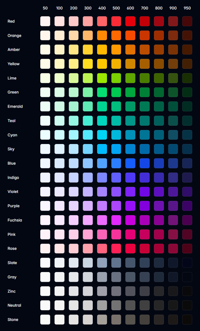
| Utility | 情境寫法 | 說明 |
|---|---|---|
bg-* |
.bg-{color}-{steps}/{opacity} |
設定元素的背景顏色 |
text-* |
.text-{color}-{steps}/{opacity} |
設定元素的文字顏色 |
decoration-* |
.decoration-{color}-{steps}/{opacity} |
設定元素的文字裝飾顏色 |
border-* |
.border-{color}-{steps}/{opacity} |
設定元素的邊框顏色 |
outline-* |
.outline-{color}-{steps}/{opacity} |
設定元素的外框顏色 |
shadow-* |
.shadow-{color}-{steps}/{opacity} |
設定方塊陰影的顏色 |
inset-shadow-* |
.inset-shadow-{color}-{steps}/{opacity} |
設定內嵌方塊陰影的顏色 |
ring-* |
.ring-{color}-{steps}/{opacity} |
設定環形陰影的顏色 |
inset-ring-* |
.inset-ring-{color}-{steps}/{opacity} |
設定內嵌環形陰影的顏色 |
accent-* |
.accent-{color}-{steps}/{opacity} |
設定表單控制項的強調色 |
caret-* |
.caret-{color}-{steps}/{opacity} |
設定表單控制項中的插入符號顏色 |
fill-* |
.fill-{color}-{steps}/{opacity} |
設定 SVG 元素的填滿顏色 |
stroke-* |
.stroke-{color}-{steps}/{opacity} |
設定 SVG 元素的筆畫顏色 |
透明度參數說明:
透明度參數可以是 0 ~ 100(5 的倍數)或任意值/CSS 變數:
<!-- 無透明度(預設完全不透明) --> |
自訂 Customization
TailwindCSS v4.1 提供了全新的自訂方式,使用 CSS 變數和 @theme 指令來定義主題。這種方式更符合現代 CSS 標準,也更容易與設計系統整合。
主題變數 Theme variables
使用 @theme 指令可以定義專案專屬的 CSS 變數,這些變數會自動對應到 Tailwind 的 utility 類別 class。
| theme 命名空間 | 情境寫法 | CSS 屬性 | 可用 Variant 變體 |
|---|---|---|---|
| –color-* | --color-loki-500: #3b82f6; |
background-color, color, border-color | .bg-loki-500、.text-loki-500 |
| –font-* | --font-loki: "Loki Font", sans-serif; |
font-family | .font-loki |
| –text-* | --text-loki: 4rem; |
font-size | .text-loki |
| –font-weight-* | --font-weight-loki: 900; |
font-weight | .font-loki |
| –tracking-* | --tracking-loki: 0.1em; |
letter-spacing | .tracking-loki |
| –leading-* | --leading-loki: 1.75; |
line-height | .leading-loki |
| –breakpoint-* | --breakpoint-loki: 480px; |
@media (min-width) | loki: |
| –container-* | --container-loki: 800px; |
@container | @loki: |
| –spacing-* | --spacing-loki: 8rem; |
padding, margin, width, height | .p-loki、.m-loki |
| –radius-* | --radius-loki: 1rem; |
border-radius | .rounded-loki |
| –shadow-* | --shadow-loki: 0 10px 25px rgba(0,0,0,0.2); |
box-shadow | .shadow-loki |
| –inset-shadow-* | --inset-shadow-loki: inset 0 2px 4px rgba(0,0,0,0.1); |
box-shadow | .inset-shadow-loki |
| –drop-shadow-* | --drop-shadow-loki: 0 4px 8px rgba(59,130,246,0.3); |
filter: drop-shadow() | .drop-shadow-loki |
| –blur-* | --blur-loki: 20px; |
filter: blur() | .blur-loki |
| –perspective-* | --perspective-loki: 1000px; |
perspective | .perspective-loki |
| –aspect-* | --aspect-loki: 21/9; |
aspect-ratio | .aspect-loki |
| –ease-* | --ease-loki: cubic-bezier(0.68, -0.55, 0.265, 1.55); |
transition-timing-function | .ease-loki |
| –animate-* | --animate-loki: fadeIn 0.5s ease-out; |
animation | .animate-loki |
例如,當你新增主題變數(如 --color-loki-500),就能直接在 HTML 中使用 bg-loki-500、text-loki-500 或 fill-loki-500 等語法,無需額外設定,讓自訂顏色與 Tailwind 原生色彩一樣方便靈活。
@import "tailwindcss"; |
<div class="bg-loki-500"></div> |
在 Tailwind 專案中,若你希望某個 CSS 變數「直接對應到 Tailwind 的公用程式類別」(如 bg-自訂色、text-自訂色),請使用 @theme 來定義主題變數。這樣 Tailwind 會自動產生對應的 utility 類別 class,方便你在 HTML 直接套用。
如果你只是單純想定義一般 CSS 變數(不需要對應到 utility),則建議用原生 css 的 :root 來宣告。這類變數不會被 Tailwind 轉換成 utility 類別,適合用於純 CSS 計算、動畫或其他自訂用途。
小技巧:主題變數與一般變數的選擇
@theme:用於設計系統 token,會自動產生 Tailwind utility class。:root:用於純 CSS 變數,不會產生 utility class。
覆蓋預設布景主題
TailwindCSS 初始載入會提供預設的佈景主題的變數組合,它存在於一開始匯入的 @import "tailwindcss"; 中,這些變數可能會與您的專案接著所定義的自訂主題變數組合產生撞名並覆蓋。
@theme { |
因此,當你在專案中接著定義自己的 @theme{...} 時與預設佈景主題的變數進行合併。如果你定義與預設佈景主題相同名稱的變數會覆蓋掉預設值。這種覆蓋機制讓你能夠客製化主題。也能清除預設主題的變數。
@import "tailwindcss"; |
定義動畫關鍵影格
在 @theme 中定義 –animate-* 主題變數可以建立自訂的動畫關鍵影格。這些動畫效果會自動產生對應的 utility class,讓你能在 HTML 中直接使用。以下是一個範例:
import "tailwindcss"; |
如果希望該 keyframe 也能在 CSS 中使用,請在
@theme外部當作普通 css 定義。
theme 參數 inline
@theme inline 是 TailwindCSS v4.1 的新功能,允許您在不建立額外 CSS 檔案的情況下,直接在現有的 CSS 檔案中定義主題變數。這種方式特別適合需要快速調整或覆蓋特定主題變數的場景。
@import "tailwindcss"; |
實際應用場景:
覆蓋預設字體:
@import "tailwindcss";
@theme inline {
  /* 將預設的 sans 字體改為 Inter 字體 */
  --font-sans: var(--font-inter);
}快速調整顏色:
@import "tailwindcss";
@theme inline {
  /* 覆蓋預設的藍色為品牌色 */
  --color-blue-500: #1e40af;
  --color-blue-600: #1d4ed8;
}調整間距系統:
@import "tailwindcss";
@theme inline {
  /* 增加更大的間距選項 */
  --spacing-18: 4.5rem;
  --spacing-22: 5.5rem;
}
| 特性 | @theme |
@theme inline |
|---|---|---|
| 檔案位置 | 通常獨立的主題檔案 | 在現有 CSS 檔案中 |
| 使用時機 | 專案級別的主題定義 | 快速覆蓋或調整 |
| 覆蓋範圍 | 全域生效 | 僅在該檔案中生效 |
| 維護性 | 集中管理,易於維護 | 分散在各檔案中 |
| 適用場景 | 主要主題設定 | 特定頁面或元件的客製化 |
使用建議:
- 使用
@theme定義主要的設計系統變數 - 使用
@theme inline進行快速調整或覆蓋 - 避免在
@theme inline中定義大量變數,保持檔案簡潔 - 考慮使用註解說明為什麼需要覆蓋特定變數
theme 參數 static
@theme static 是 TailwindCSS v4.1 中用來定義靜態 utility classes 的指令。與動態的 theme 變數不同,靜態類別不會被 tree-shaking 機制移除,即使它們在專案中沒有被使用到,也會被保留在最終的 CSS 檔案中。
@import "tailwindcss"; |
與其他 theme 指令的比較:
| 指令類型 | 用途 | Tree-shaking | 適用場景 |
|---|---|---|---|
@theme |
定義動態主題變數 | ✅ 會被移除 | 設計系統變數 |
@theme inline |
快速覆蓋主題變數 | ✅ 會被移除 | 特定檔案覆蓋 |
@theme static |
定義靜態 utility classes | ❌ 不會被移除 | 動態類別保護 |
使用注意事項:
- 謹慎使用
@theme static,過度使用會增加 CSS 檔案大小 - 優先使用
@theme定義動態變數,只在必要時使用@theme static - 定期檢查
@theme static中的類別是否仍然需要
主體變數本質是 CSS 變數
@theme 本身是用 css 文件來定義的,因此可以透過 @import 的方式來引入。方便在不同子專案目錄下使用同樣的主題定義。
@theme { |
@import "tailwindcss"; |
最後當進行編譯時,會將 @theme 的內容將轉換為原生 css 變數。
:root { |
在任意值中使用主題變數可能很有用,特別是與calc()函式結合使用。
<div class="relative rounded-xl"> |
或者需要透過 javascript 來控制主題變數的值或取得。
<motion.div animate={{ backgroundColor: "var(--color-blue-500)" }} /> |
自訂樣式
您可以在 TailwindCSS 公式表中定義自訂樣式,以滿足特定的需求。包含稍早在範例中的@theme 指令,你可以在@theme 自訂想要的變體類別。
@theme { |
自訂任意值
或者在現有的變體上,透過中誇號方式,使用任意自訂值作為自訂效果。
<div class="top-[117px]">...</div> |
也可以使用 css 變數來帶入成為自訂樣式(使用小誇號)。
<div class="fill-(--my-brand-color)">...</div> |
如果你需要暫時的覆蓋 theme 的主題變數,可以 class 直接寫入一個中誇號。他就像 @theme inline 的覆蓋預設布景主題變數。
<!-- 覆蓋原本主題變數 --> |
任意變體(Arbitrary Variants)是一種進階的選擇器修改方式,讓你能在 HTML 中直接使用自訂的 CSS 選擇器。它的概念類似於一般的變體(如 hover:、md: 等),但提供更大的彈性,可以直接在 HTML 中使用中括號語法來定義複雜的選擇器規則。以下範例展示如何使用任意變體,在大螢幕(lg)時,讓列表中的前三個項目在滑鼠懸停時出現底線:
<ul role="list"> |
注意的是,如果任意值的原本屬性是需要空格的地方,在中括號語法中,需要使用底線_讓 tailwind 自動轉換。但也不是所有的自斷都會轉換,由 tailwind 判定。極少入會發生誤判,可用反斜線轉義底線,Tailwind 不會將其轉換為空格。
<div class="grid grid-cols-[1fr_500px_2fr]">...</div> |
如果你使用 react,預設行為會對反斜線從渲染的 HTML 中剝離,請額外使用 String.raw(),這樣反斜杠就不會被視為 JavaScript 轉義字元。
<div className={String.raw`before:content-['hello\_world']`}>...</div> |
在主題變數可以看到 text-* 作為 font-size 的定義,但 text-{color} 也是共用該命名空間。因此 Tailwind 會自動判定任意值作為色碼還是單位給誰使用。只有當使用 css 變數時會無法自動判定。因此你需要提示 type 告知 tailwind。
<!-- Will generate a font-size utility --> |
基底樣式 base styles
大範圍的預設值效果,可以根據 css 的繼承特性,將一些 css 設定於 root 元素上。
<html lang="en" class="bg-gray-100 font-serif text-gray-900"> |
然而如果需要特定的 html 元素有自己的預設基本樣式,可以透過 @layer base 定義。
@layer base { |
版型元件 Layer component
@layer components 是 TailwindCSS 中用來定義可重複使用的元件樣式的指令。這種方式特別適合處理無法直接控制的 HTML 內容,如來自 CMS、API 或 Markdown 轉譯的內容。
基本語法:
@import "tailwindcss"; |
使用主題變數的優勢:
- 設計一致性:直接使用 Tailwind 的主題變數,確保視覺統一
- 維護性:當主題變數更新時,元件樣式自動同步
- 可讀性:語義化的變數名稱,讓程式碼更易理解
- 靈活性:支援響應式設計和狀態變化
元件設計建議:
- 優先使用主題變數,確保設計一致性
- 保持元件的可組合性,避免過度耦合
- 使用語義化的類別名稱
- 考慮響應式設計和可訪問性
- 定期重構,移除未使用的樣式
注意事項:
@layer components中的樣式不會被 tree-shaking 移除- 避免在元件中定義過多具體的數值,優先使用主題變數
- 考慮使用 CSS 自訂屬性來支援動態主題切換
- 定期檢查元件的使用情況,避免樣式膨脹
組合通用工具 apply
使用 @apply 指令將任何現有的通用工具類別內嵌到您自己的自訂 CSS class 中:
.select2-dropdown { |
當您需要編寫自訂 CSS(例如覆蓋第三方庫中的樣式)但仍想使用您的設計令牌並使用您習慣在 HTML 中使用的相同語法時,這非常有用。
引用變體 variant
@variant 指令是讓您可以在自訂 CSS 中使用 TailwindCSS 的變體系統。這個功能特別適合需要複雜互動狀態或主題切換的元件,讓您能夠在保持 TailwindCSS 一致性的同時,實現更靈活的樣式控制。
主要優點:
- 語法簡潔:透過
@variant帶入 tailwind 的變體,省去手動寫原本相同邏輯的設計 - 自動編譯:TailwindCSS 會自動將
@variant轉換為標準的 CSS 媒體查詢 - 變體組合:支援巢狀變體,可以組合多個狀態條件
- 一致性:與 TailwindCSS 的變體系統保持一致,便於維護
.my-element { |
編譯後的輸出:
.my-element { |
變體組合說明:
@variant dark:深色模式,編譯為@media (prefers-color-scheme: dark)@variant hover:滑鼠懸停狀態,編譯為@media (hover: hover)- 巢狀變體會自動組合,形成複合條件
- 支援所有 TailwindCSS 內建的變體,如
focus、active、sm:、md:等
自訂 utility
除了使用 Tailwind 內建的工具類別外,你也可以透過 @utility 指令來建立自訂的通用工具類別。這在以下情況特別有用:
- 需要使用 Tailwind 未內建的 CSS 功能
- 想要建立專案特定的通用類別
- 需要將常用的 CSS 組合打包成單一類別
@utility content-auto { |
如此一來,你可以在 html 上使用自己的 utility 類別,並搭配 tailwind 的變體。
<div class="content-auto">...</div> |
也能產生複雜的通用工具,例如,需要巢狀的 selector 定義:
@utility scrollbar-hidden { |
--value() 函式
在自訂 utility 時,我們可以使用--value()函式來根據不同規則為聲明,最終返回一個值。如果是以指定文字的字串常值,可以用""包覆選項,以下這將匹配 tab-inherit、tab-initial 和 tab-unset。
@utility tab-* { |
--value()函式要根據哪種規則為聲明,可以混和或單一規則,以下例子為混和三種型式。如果是無法解析出的規則會自動忽略。
- 任意隨意輸入,可以用
[integer]為參數,以下這將匹配tab-[2]、tab-[76]。 - 另一種
--value()是直接 integer 裸值,由 class 名決定參數為多少。可以匹配tab-1、tab-99。 - 這透過
--value()變數來控制具備 function 用途的通用工具。藉由參數對應,轉換為主題變數,這將匹配tab-2、tab-4和tab-github等應用。
@theme { |
也可以根據自己的需求,透過 calc 做複雜的運算,例如將整數轉換為百分比。
@utility opacity-* { |
--value()函式由於可以接受多個參數,因此剛出現的代碼可以簡化成下面這樣的簡潔寫法,他會依序從左往右尋找合適的規則:
@theme { |
負值也是可以的,但是需要另外宣告一組 utility 成為 - 前綴。
@utility inset-* { |
--modifier() 修飾符
該函式的工作原理與 --value() 函式完全相同,但對修飾符(如果存在)進行操作。修飾符是指在 utility 類別名稱後面的額外參數,通常用斜線 / 分隔。
例如在 text-lg/relaxed 中:
text-lg是主要的 utility 類別relaxed是修飾符
@utility text-* { |
ratio 分數
ratio 型別用於處理長寬比例的數值,通常以分數形式表示(如 16/9、4/3 等)。這個型別主要用於 aspect-ratio 相關的 utility 類別中。
支援的格式:
- 預設關鍵字:
aspect-square(1/1) - 分數形式:
aspect-3/4、aspect-16/9 - 任意值:
aspect-[7/9]
使用範例:
@utility aspect-* { |
自訂變體 custom-variant
除了使用 Tailwind 隨附的變體之外,您還可以使用 @custom-variant 指令新增自己的自訂變體:
@custom-variant theme-midnight { |
@custom-variant為樣式層級指令。@slot代表「在此插入目標類別的宣告內容」;&:where(...)用於建立低權重選擇器以避免特異性衝突。
在 HTML 中,我們能使用該變體;效果為:當元素具有 data-theme="midnight" 屬性時,套用被此變體修飾的樣式。
<html data-theme="midnight"> |
如果該變體沒有太多巢狀規則,可以簡化為一行:
@custom-variant theme-midnight (&:where([data-theme="midnight"] *)); |
當需要控制多個條件或包含互動狀態時,維持多行寫法可讀性更佳;簡化成一行較適合單一條件的情境。
@custom-variant any-hover { |
以上變體可與其他 Tailwind 變體鏈接使用,例如:theme-midnight:hover:bg-zinc-900,以組合情境與互動狀態。
偵測來源的 class
Tailwind 的工作原理是掃描您的專案中的實用程式類,然後根據您實際使用的類別產生所有必要的 CSS。這可確保您的 CSS 盡可能小,並且也使任意值等功能成為可能。Tailwind 會將所有原始檔案視為純文字,並且不會嘗試以任何方式實際解析您的檔案為程式碼。相反,它只是根據 Tailwind 在類別名稱中期望的字元來尋找檔案中可能成為類別的任何標記:
以下為 React 在 JSX 內如何正常使用 Tailwind 並且偵測成功。只要您在程式碼中始終使用完整的類別名稱,Tailwind 每次都會完美地產生您的所有 CSS。
export function Button({ color, children }) { |
然而你需要注意的是,根據 Tailwind 的掃描機制,以下範例不會被偵測到,因為在 utility 類別名稱中段插入變數,無法形成可靜態分析的完整類別標記。
// 錯誤寫法(在類別名稱中段插值) |
明確註冊來源
在 TailwindCSS v4.1 中,類別名稱的來源偵測已經全面改為「來源註冊」機制,不再依賴 tailwind.config.js 的 content 欄位。
Tailwind 會自動掃描專案目錄下所有純文字檔案(如 .html、.js、.jsx、.ts、.tsx、.vue 等),並自動排除下列類型的檔案:
node_modules目錄下的所有檔案.gitignore中排除的檔案- 二進位檔案(如圖片、音訊、影片、壓縮檔等)
- 常見 IDE 產生的鎖定檔案(如
.lock、.DS_Store等) - 以底線(
_)開頭或結尾的檔案(預設不掃描)
如果你需要更精細地控制來源,可以使用 @source 指令手動註冊或排除特定目錄與檔案。這讓 Tailwind 能夠更精確地產生所需的 CSS,並避免不必要的掃描與檔案膨脹。
v4.1 新觀念:
Tailwind v4.1 採用自動來源偵測與 @source 明確註冊,無需再手動維護 content 欄位,專案結構更彈性,掃描更聰明。
反之,如果你需要特別排除上列某個條件,例如第三方套件會使用到的 tailwindcss,可以使用 @source 明確註冊相對於樣式表的來源路徑:
@import "tailwindcss"; |
預設情況下 Tailwind 會掃描專案中的所有檔案,但如果您需要掃描特定目錄,可以使用 @source 明確註冊來源路徑。
@import "tailwindcss" source("../src"); |
通常這發生在 monorepo 專案的規劃,因為專案根目錄不能代表子專案目錄所使用。
當您的專案中有大型目錄,而您知道這些目錄不使用 Tailwind 類別時,例如舊版元件或第三方程式庫,可以用@source not排除,這非常有用。
@import "tailwindcss"; |
或者你想改用手動的方式去註冊所有來源,先使用source(none)完全停用自動來源偵測,然後使用@source來明確註冊來源路徑。
@import "tailwindcss" source(none); |
若你需要確保產生出來的 css 要包含特定的類別名稱,可以透過@source inline()來明確要求生成而不用掃描。
@import "tailwindcss"; |
最終生成的 css 就一定會包含而不會被 tree shaking 排除。
.underline { |
使用@source inline()來產生具有變體的類別。例如,若要產生具有暫留和焦點變體的底線類別,請將 {hover:,focus:,}新增至來源輸入:
@import "tailwindcss"; |
最終生成的 css 就一定會包含而不會被 tree shaking 排除。
.underline { |
同上,除了包覆變體作為來源,也可以包覆多個類別命名作為範圍值:
@import "tailwindcss"; |
這會產生 200 到 800 的紅色背景顏色,增量為 100,以及第一個 50 和最後一個 950。它還為每個類別添加了hover:變體。
.bg-red-50 { |
若你需要確保不要產生出來的 css 要包含特定的類別名稱,可以透過@source not inline()來明確要求生成而不用掃描。
@import "tailwindcss"; |
這會明確排除紅色背景通用工具,及其 hover 與 focus 變體,從產生 css 檔案內所排除。
內建函式
Tailwind 提供--alpha()透明度函式與--spacing()間距函式,讓處理色彩和間距比例更輕鬆:
使用 --alpha() 函式調整顏色的不透明度:
輸入 CSS:
.my-element { |
編譯後 CSS:
.my-element { |
使用 --spacing() 函式根據您的主題產生間距值:
輸入 CSS:
.my-element { |
編譯後 CSS:
.my-element { |
這在任意值中也很有用,特別是與 calc() 結合使用時:
HTML:
<div class="py-[calc(--spacing(4)-1px)]"> |
小技巧:這些函式在自訂 CSS 中特別有用,可以確保與 Tailwind 的設計系統保持一致,同時提供更多彈性來處理複雜的計算需求。
預先載入 Preflight
Preflight 是 Tailwind CSS 的基礎樣式 layer base 重置系統,它基於 modern-normalize 建立,為所有瀏覽器提供一致的基礎樣式起點。
主要功能
Preflight 會自動套用以下基礎樣式:
/* 從所有元素中移除所有預設邊距 */ |
自訂 Preflight
如果您想在 Preflight 之上新增自己的基本樣式,請使用@layer base{},如先前提到的 基底樣式 做法,定義預設基本樣式。
@layer base { |
小技巧:Preflight 確保您的專案在所有瀏覽器中都有一致的基礎樣式,建議除非有特殊需求,否則不要停用它。如果遇到第三方元件樣式衝突,可以考慮使用 @layer 來管理樣式優先級。
取消 Preflight
預設會隨著@import "tailwindcss"載入,如果您不想使用 Preflight,可以在 Tailwind 配置檔中禁用該行:
@layer theme, base, components, utilities; |